Which picture is best.

  • Active since 1995, Hearth.com is THE place on the internet for free information and advice about wood stoves, pellet stoves and other energy saving equipment.

    We strive to provide opinions, articles, discussions and history related to Hearth Products and in a more general sense, energy issues.

    We promote the EFFICIENT, RESPONSIBLE, CLEAN and SAFE use of all fuels, whether renewable or fossil.
Status
Not open for further replies.

BJ64

Minister of Fire
Jul 24, 2008
616
NE Oklahoma
It is county fair time here. My wife is entering the black and white photo contest. Since I know nothing about photography, I need help, helping her picking something to enter. She can enter two pics in the class.

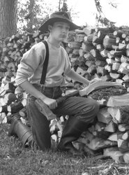
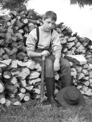
Which two of these pics is the best for her to enter? The idea is to look like a picture from the 1930's or older.

The kid in the pic is our middle son.
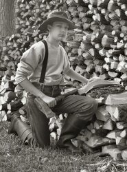
 

Attachments

  • pic1.jpg
    pic1.jpg
    85.1 KB · Views: 963
  • pic2.jpg
    pic2.jpg
    83.4 KB · Views: 989
  • pic3.jpg
    pic3.jpg
    81 KB · Views: 961
I think the middle one, looks more like he got interrupted at work.
 
Absolutely the middle one.

The pose and naturalness of subject is better IMHO, but also - and just as important - the picture quality is superior. The middle photo has much better contrast and light balance throughout, good detail of the face of subject as well as background, and the improved contrast makes it look sharper as well. You are able to pickup more fine detail in the pic because of the contrast.

The photo on the left for example, has washed out contrast - you can see light "smearing" across the middle including the subject's face. If I were to guess, the photopgrapher took the photo with some angle into the light without shielding the lens or using a filter. Or the lense had a fingerprint on it or something. The photo in the middle was either taken down sun - which by the way is usually better - or under shade with longer exposure or had the lense shielded by shadow eg tree or something.

If you can submit 2, I would dress the subject (your son?) up in the same gear and have one of him swinging the maul down for a split (take it down sun as well). An action shot with subsequent respite pic is a nice contrast for a pair and something judges look out for as well. Good luck.
 
Yeah I'll go with the middle one too...although the one on the far right tells a story.
 
Middle one is best for contrast, etc. I would also go back and take some more that are less posed, pictures that are captured when the subject isn't "posing" for them are almost always better. For instance, really get him to split some rounds and get some pics of him while he's really tired from swinging. Good luck and have fun, photography is a great hobby.
 
I would also choose the middle one, looks more like an old time photo.
 
My fiancee and I both feel that the far right picture is the best overall of the 3 because the attitude of the subject is more like what would be displayed by a boy of that age in the 30's.

The middle picture looks more modern in our opinions.

Shipper
 
As a semi-professional photographer myself since the age of 13, I would select either the middle one or right one.
Some judges like to see eye contact in Portraits and some like candid ones.
What is most important in BW photos is sharp contrast, especially contrast that seperates the subject from foreground to background. If you take a piece of paper and cover the left hand side of the middle picture it is more pleasing to the eye (too me anyways) my eye is drawn away from the distracting white highlights.
You could also bump up the contrst of his jeans and sweatshirt to make the image "pop" a little more. Taking down the contrast on the lefthand side background will do this also.
The image on the right would be "Outstanding" to a judge if the boy was taking off his hat (or hat placed in the lap) looking down and not at the camera ...this would set the stage as a story "As if the days work was complete" the blown highlights in the sky distracts the image "pop" also.........I am my own worst critic, judges have ripped apart my stuff for years.......take this with a grain of salt....

WoodButcher
 
Guess I'll be the odd man out here....I say for naturalness and pose the first one is best. However I agree that it isn't as crisp in contrast as the second one.....has more of a "white wash" look to it. Maybe had to do with the lighting.

If you could get the left pose with the crispness of the middle one, you'd have yoursef a winner!
 
I believe I read you wanted 2 picks, so my vote is for the first 2. The ones with the hat on make it look more that time era believable.
 
I like the first two pics. IMO the middle one is the best of the bunch.
 
The first two look original in my opinion.
 
First / Left one. Nice job.
 
i liked the third one , kid looks pooped in a way , kinda shows the look of "boy im glad thats over, where's the lemonade?"

all 3 are shots that are worthy of praise though, i liked the second one as well , but his face is shaded by the hat a bit, ring that darkness out a bit and you have a winner there as well. shame you cannot submit all 3 , they are all excellent shots. my complements!
BTW , my daughter said "he's a cutie" . nice looking young man.
 
I actually like the left one the best. I like the soft focus and the fact that the contrast isn't too harsh. Composition looks pretty good and seems to convey "feeling".

The background on the middle pic is a bit cluttered with the tree, bright patch to the left of the subject / shaded area to the right, wood at the feet, weeds in the background - hard to see a good outline of the subject. Angle of the shot is unremarkable...he is standing, you are standing shooting straight across at him. Contrast, to me, is a bit harsh, focus is super sharp - looks like a modern photo that was rendered in B&W;. I also kind of get that "He's coming at me with an ax!!" feeling.

The far right photo is pretty nice, good background and composition...though it seems a bit 'staged'...like"here, set on this wood pile, look a bit tired and run down, I'll take your picture!" But again, conveys feeling. If the subject was a bit dirtier and sweaty, I might get the feeling he just split and stacked all that wood.

My unprofessional opinion - left = 1, center =3, right =2

Good luck which ever one you choose.
 
They are all good, but I'm surprised at the responses, since I think the one on the left, photographically, is the best.

The one in the middle has the dark hat and head blending in with the foliage, and the background is too busy for my liking.

The one on the right also has the problem of the distracting bright white background in the upper right.

To show you what I mean about background, here's the left one with a less distracting background, and adjusted contrast.
 

Attachments

  • firewood.jpg
    firewood.jpg
    100.2 KB · Views: 251
WarmGuy said:
They are all good, but I'm surprised at the responses, since I think the one on the left, photographically, is the best.

The one in the middle has the dark hat and head blending in with the foliage, and the background is too busy for my liking.

The one on the right also has the problem of the distracting bright white background in the upper right.

To show you what I mean about background, here's the left one with a less distracting background, and adjusted contrast.

Al, I don't know what you've done with the contrast settings, but his head and hat look a bit "Jedi Apparition"-ish to me! :) Kind of superimposed on the background.

I think for B&W;you want better contrast. If you want a "warm" or washed out contrast pic, go semi-tone, that kind of browny-yellow film look in the 1800's.

I agree about the need for some dirt and sweat in the pic on the right, and as I said originally, I reckon an action shot would work well if pairing two pics together.

Why don't you get him to actually split a whole new pile of wood, get some action shots (down sun for good contrast) and then when he is dirty and sweaty take those final shots as per the right pic? Bonus - you get another pile of split wood hehe!!
 
Wow thanks for all the feed back!

We are off to go enter the pics in the fair.

They will be judged tomorrow and I'll report back how they did.
 
The 2008, Mayes County fair is about over.

I hate to report that NONE of the three pictures came back from the Wal-Mart photo thing in show condition. I must add that it was not Wal-Mart's fault. We had a power outage which messed up some computer things here and also disrupted their photo system. If it was not for the last second I suspect not much would ever get finished.

However, Deb did have a back up photo and it came in 4th in its class. In this case the class was listed as a special effect because it was antiqued in color rather than black and white greyscale. Many of the photo's Deb was showing against was not limited to simulate any time period. The photo contest is quite popular here and it was a common opinion that the competition was quite stiff. I was pleased with the placement. (DISCLAIMER: The conversation about the quality of competition was among a color blind veterinary and a hay bailer mechanic.)

While the photo is not wood related, I wanted to share the results anyway. Again, thanks for all the feedback. This photo is in one of the creeks here on the home place.
 

Attachments

  • Mattpose2.jpg
    Mattpose2.jpg
    89.2 KB · Views: 192
Status
Not open for further replies.