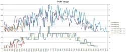
Pellet Consumption Graph

  • Active since 1995, Hearth.com is THE place on the internet for free information and advice about wood stoves, pellet stoves and other energy saving equipment.

    We strive to provide opinions, articles, discussions and history related to Hearth Products and in a more general sense, energy issues.

    We promote the EFFICIENT, RESPONSIBLE, CLEAN and SAFE use of all fuels, whether renewable or fossil.
Status
Not open for further replies.
How are you measuring pellets daily? Do you scoop out the remaining pellets each day and measure? Confused a bit..

Way to go by the way!!
However many pellets I add to the stove in the morning is the amount I burned the day before.
 
Adding the temps is important to paint the full picture.

I think you mean adding the temps in might actually turn that graph into something with at least a little meaning. Just looking at day-day comparisons with two different year spread means, well, nothing. To measure any kind of efficiency you’d have to compare fuel consumed to the heating load of the house which is based on temperature, wind speed, amount of sunlight hitting the house at what angle, humidity... all integrated for a day or whatever time period you are comparing. And that assumes you haven’t changed anything thermally within the house and are heating to the exact same average temperature. Basically this is near impossible for the average homeowner to do. Even if you averaged out your total fuel for the entire year (way way way more accurate that just comparing a few days) it still could be way different conditions from one year to the next even if the average temps were fairly close. It's cool to take all these measurements and comparisons, just don't read into them too much.
 
  • Like
Reactions: tjnamtiw
Per suggestions given, I have added degree days to the chart. I may break each year out into it's own graph since this one is looking a bit busy.

Pellet usage is on the left axis, degree days is on the right.

Pellet Usage.jpg
 
I'd suggest doing a mixed graph with bars for degree day and lines for pellets. to get something like the 2nd or 3rd graph here

Example.png
 
Now match the colors of the lines. So 2012-2013 pellet usage should match the color of 2012-2013 temps. Easier on the eyes and ole brain.
 
Per suggestions given, I have added degree days to the chart. I may break each year out into it's own graph since this one is looking a bit busy.

Pellet usage is on the left axis, degree days is on the right.

View attachment 143566
So, basically, you're determining your K-factor for pellet heat. Home heating oil companies calculate a homeowner's K-factor to determine when to deliver. They track your degree days, and how much oil you have used historically to calculate a K-factor. By doing that they can then predict when next to come fill your tank.

Let's do a quick example. If your house has an oil K-factor of 10, that means for every 10 degree days, you use one gallon of oil. In everyday words, that means if a day averages 55 degrees, that's 10 degree days, and you used 1 gallon of oil, you have a K-factor of 10. If you used 2 gallons of oil, you'd have a K-factor of only 5.

A very rough approximation, if that same home with an oil K-factor of 10, switched to pellets, since a bag of pellets is worth about 2.4 gallons of oil would be a new pellet K-factor of 24, i.e. one bag of pellets per 24 degree days. You can use whatever units you want, since I don't think anyone has ever calculated a pellet K-factor, but since most of us think in terms of bags, as opposed to pounds, it's probably best to use bags.

Just looking at Tim's chart, it would appear he has a pellet K-factor of about 20. So, for every 20 degree-days, he uses 1 bag of pellets. If it averages 45 degrees over a 24 hr period, then he might use 1 bag.
 
I ran my numbers based on 60 degrees, so a day at 50 would be 10 degree days for me.
 
Status
Not open for further replies.